Oaklet.
The team at Oaklet GmbH has been successfully operating in the fields of "Structured Products" and "Securitizations" for many years. Essential to their clients has always been the full transparency and knowledge transfer. And now it was about time to change their look.
Challenge
Rebranding financial institutions poses a significant challenge due to their deeply entrenched public perception, complex regulatory considerations, delicate management of various stakeholders, and the need to clearly communicate sophisticated services. Achieving a harmonious blend of maintaining trust while embracing modernisation remains a formidable task.
Strategy
The key challenge lies in finding a balance between preserving trust and credibility while embracing modernisation and innovation. It's a delicate dance that requires meticulous planning, thoughtful execution, and a deep understanding of the industry landscape.
Solution
Collaboration with stakeholders, including employees, clients, and regulators, is essential to ensure buy-in and alignment throughout the process. By approaching rebranding with a holistic and strategic mindset, financial institutions can successfully navigate the challenges and emerge with a refreshed identity that resonates with stakeholders and supports long-term growth.
Old design
The old design of the brand was characterised by a predominantly blue color palette, occasionally complemented by hints of purple. Geometric shapes played a prominent role, lending a structured and orderly aesthetic to our visual identity. The oak leaf served as the logo, symbolising strength, growth, and stability. However, despite these elements, there was no distinct overarching theme or narrative connecting the brand's various touchpoints.


Design approach
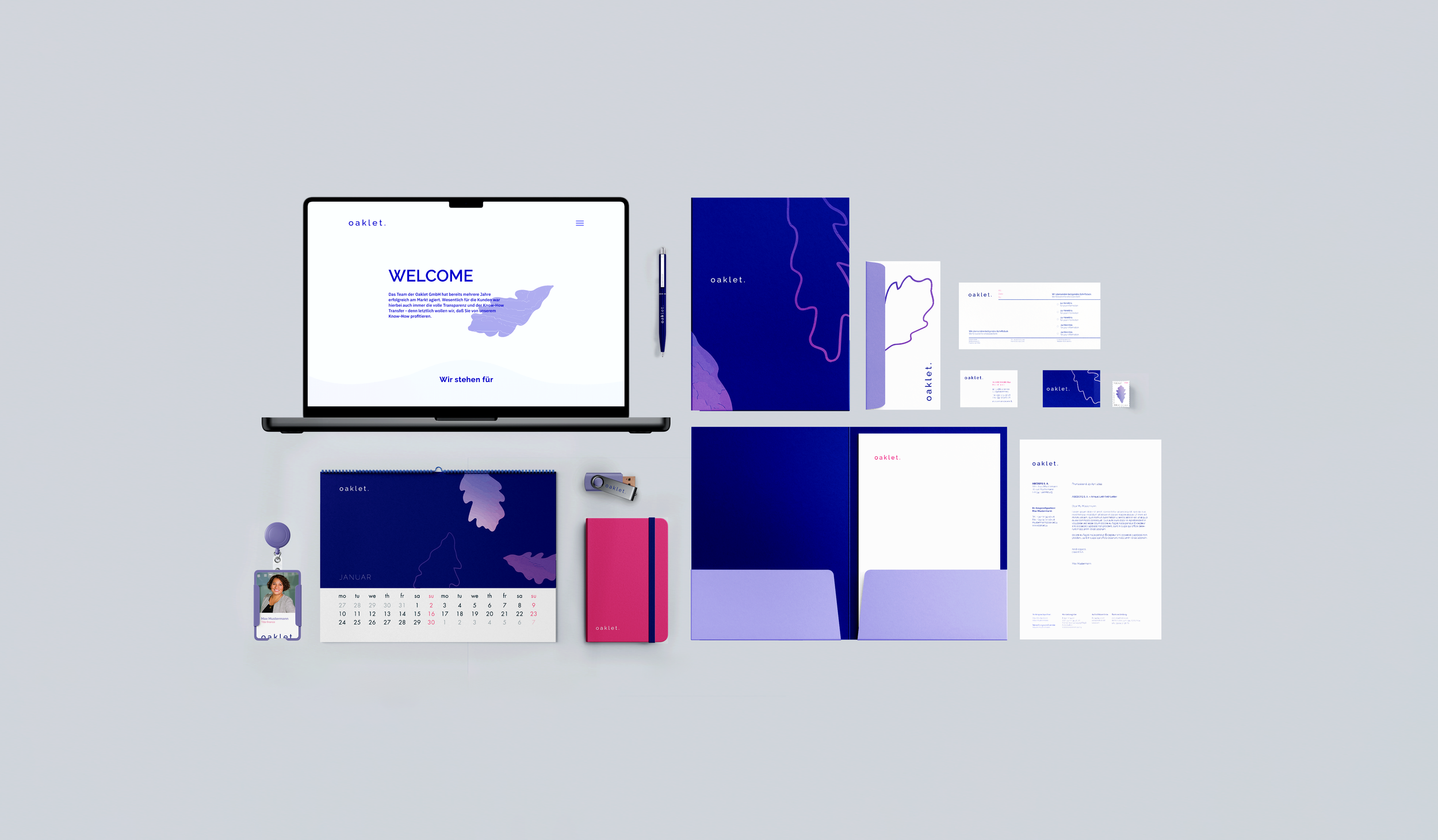
The new design honors the essence of the old aesthetic while infusing it with a fresh, modern flair. Departing from the traditional blue hues, I introduce vibrant shades of pink to add warmth and vitality. Embracing the trend of animation, our visuals come alive with dynamic motion, creating an engaging user experience. I prioritise simplicity and clarity, opting for a cleaner look that enhances usability. By adopting a unique color scheme distinct from other finance institutions, I carve out an own identity in the industry, setting themselves apart while remaining true to their roots.
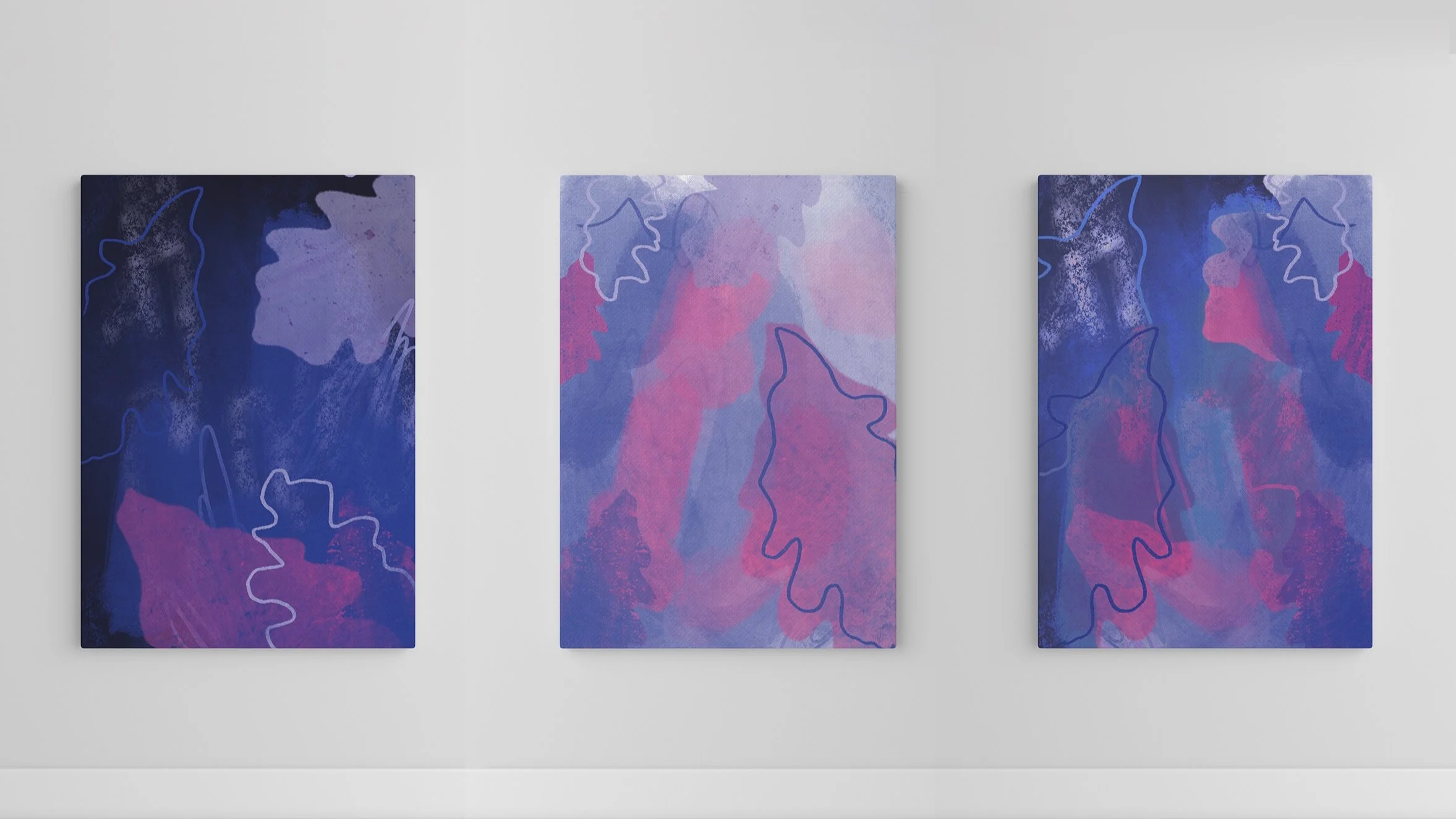
The logotype animation captures the essence of constant change in finance. The oak leaf gracefully falls, symbolizing adaptability and growth. With various iterations, I showcase the dynamic nature of the industry. As the background colours blend and morph, new shapes emerge, reflecting the evolving landscape of opportunities. The animation embodies the importance of selecting the right partner in this ever-changing environment, offering versatility and innovation to meet your business needs.
Logo animation
The updated website seamlessly merged all the previous platforms into one cohesive experience. Through clear explanations and transparent communication the complex world of "Verbriefung" is made more accessible and understandable to everyone. Additionally, I aim to foster a deeper connection with the people behind the brand, sharing their values of integrity, innovation, and collaboration.


